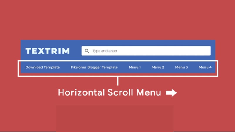
I will again share the source code (source code) of one of the free templates that have been made, namely Textrim. This time it will be discussed is about the navigation menu at the top. This menu is enough attention and at the same time raises many questions from users because of its unusual shape. So-called because of the shape that pushes to the side and to see all the menus must be scrolled horizontally.
Though the horizontal scroll menu has been used by various large sites both from Indonesia and abroad. But the amount is not as much as ordinary navigation (mostly in the form of a dropdown menu ) so it still looks "strange" to some people. I myself made this side-scrolling menu inspired by the Kaskus website. So it is actually common and reasonable, just needs to be further socialized to visitors.
For people who really have never seen side-scrolling, the menu will look like it's cut. But it is not. It just needs to be scrolled right and left.
How to Make a Textrim Horizontal Scroll Menu
To create side-scrolling navigation like Textrim, all you need is creativity in searching CSS code. You don't need all of Javascript. And what I'm sharing is the basic code. It might be incompatible with the template being used because it conflicts with the default CSS code of the template. If there is a discrepancy with the demo, please do it again and change it again yourself.
First, save the following HTML code in the place where the menu will appear. Usually, it is in the header. Just edit the link and the title contained in it.
<!-- Navigation Menu Horizontal Scroll by sayemtutorial.blogspot.com -->
<div class="ignielHorizontal">
  <ul>
    <li><a href="#" title="Download">Download</a></a></li>
    <li><a href="#" title="Tutorial">Tutorial</a></li>
    <li><a href="#" title="Video">Video</a></li>
    <li><a href="#" title="Subscribe">Subscribe</a></li>
    <li><a href="#" title="HTML5">HTML5</a></li>
    <li><a href="#" title="CSS3">CSS3</a></li>
    <li><a href="#" title="Javascript">Javascript</a></li>
    <li><a href="#" title="Make Money Online">Make Money Online</a></li>
    <li><a href="#" title="Study Case">Study Case</a></li>
  </ul>
</div>/* Navigation Menu Horizontal Scroll by sayemtutorial.blogspot.com */
.ignielHorizontal ul {
background-color: #673ab7; /* Warna background menu */
max-width: 100%; /* Lebar maksimal menu */
overflow-x: auto;
}
.ignielHorizontal {
color: #fff;
line-height: 0px;
overflow: hidden;
}
.ignielHorizontal a {
font-size: 14px;
color: #fff;
text-decoration: none;
padding: 10px 13px;
line-height: 1.5em;
display: block;
}
.ignielHorizontal a:hover {
background-color: rgba(0,0,0,.25);
color: #fff;
text-decoration: none;
}
.ignielHorizontal ul, .ignielHorizontal li {
list-style: none;
display: inline-block;
white-space: nowrap;
margin: 0px;
padding: 0px;
}
@media screen and (max-width: 480px){
.ignielHorizontal a {
font-size: 13px;
padding: 8px 11px;
}
}
@media screen and (max-width: 360px){
.ignielHorizontal a {
font-size: 12px;
padding: 7px 10px;
}
}The overflow effect that makes the menu can be shifted to the side will appear if the total number of links contained in the menu produces a width of more than 600px. If it's less than that, then the menu will look normal without being able to move around. So if the scroll effect hasn't appeared yet, first check the max-width value from the header or other parent where this menu is stored.
The result will be as follows. Please remember, this is only basic code. Make changes according to the template if it does not match the demo. Don't be afraid to kidnap.
Okay, it's finished with a simple article about making a navigation menu scroll sideways in the Textrim Blogger Theme style. Share your experience using the code above in the comments column.


0 Comments: